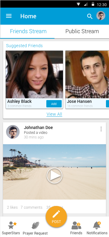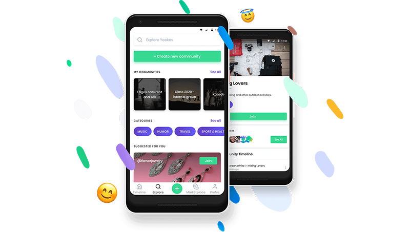
Yookos is a microblogging application that functions just like Facebook and was meant for a christian congregation, I was part of a small UX team and that required us to wear many hats.
I would be involved during the brainstorming sessions for the creation of new features, I would also do the research on users thereafter turn the insights to actual actions within the app that help solve the users’ problems.
Yookos a mobile app created for the Christ Embassy Church to add to their digital experience. The app provides its users with the ability to watch past sermons on-demand, as well as live worship experience broadcasts.
The population of viewers who engage with Yookos’s content includes people from 114 countries. Yookos understands that the church might look different in the near future, which is why they have invested ample time and resources into their digital presence. Although this may not have been what they had in mind, their readiness has been evident and crucial during the ongoing COVID-19 pandemic.
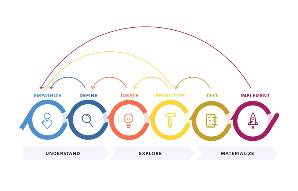
Our team applied the Design thinking methodology as the process followed to solve problems. As a keen user of the Yookos app, we have noticed that although it provides easy and convenient access to sermons, there is no way of connecting and interacting with other users — an element that would truly reinforce their global digital community. As a result, we decided to take a look at the current version of the app to see how the user experience could be improved to provide an ideal solution to user needs.
We research began with conducting a series of 1:1 interviews with five people aged 23–33 years, to help us gain a deeper understanding of how they interact with the app, what their pain points might be and how their experience could be improved.
INTERVIEW QUESTIONS:
AFFINITY MAP:
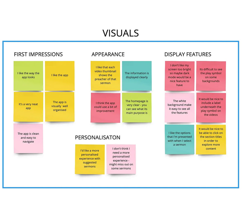
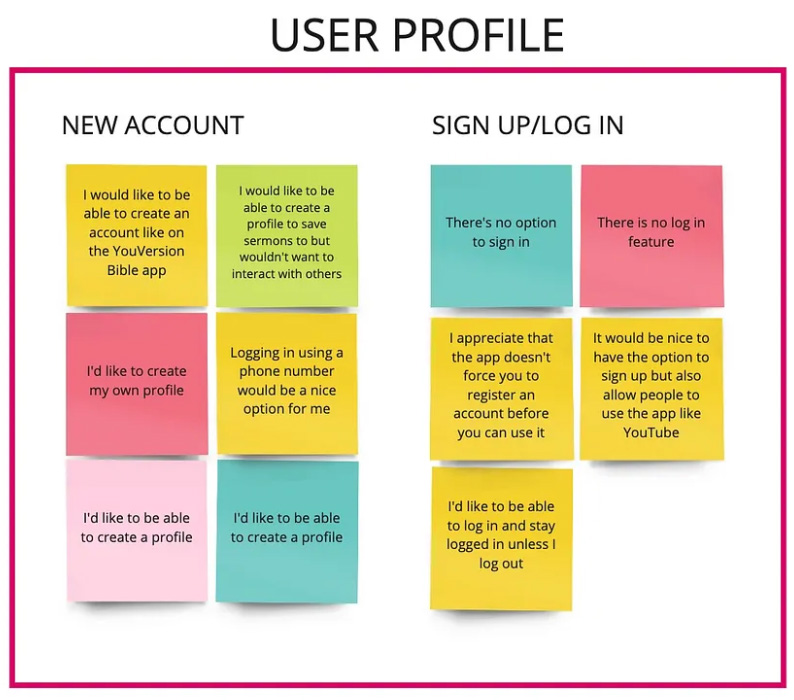
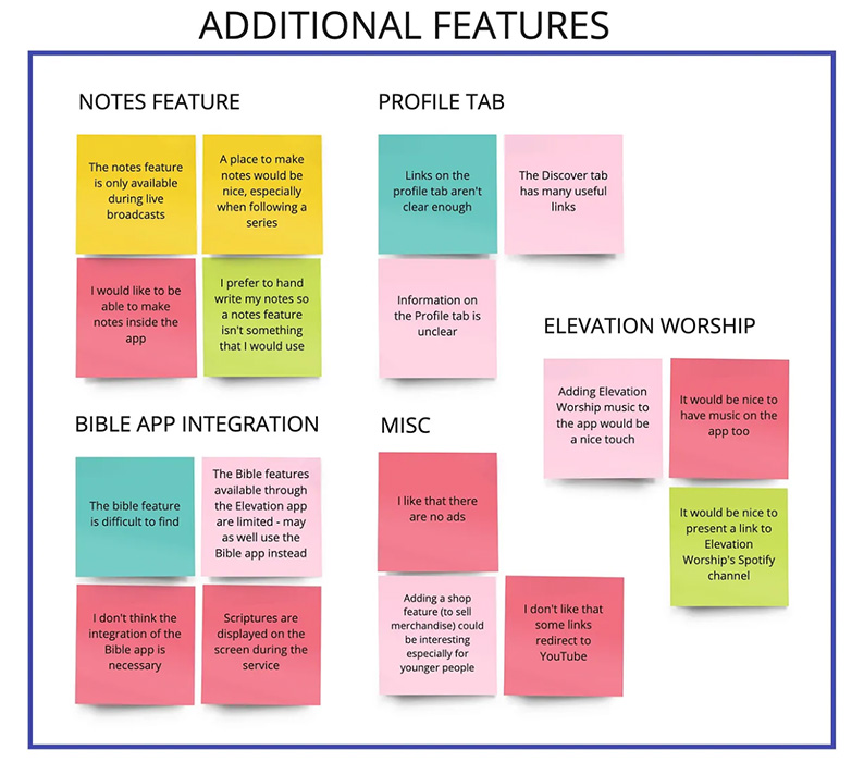
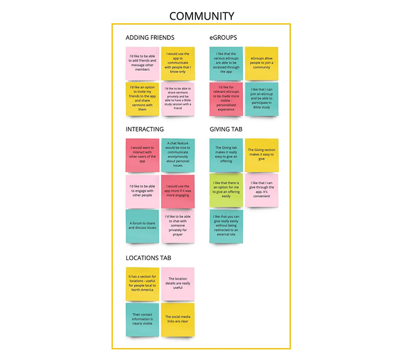
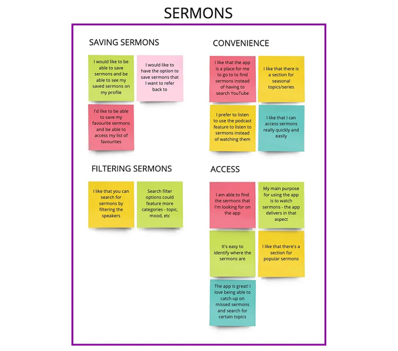
The Affinity Map below was created to help me analyse the data gathered from each individual during the user interviews.
KEY FINDING 1:
The general consensus amongst participants regarding the appearance of the app was that they are very happy with its current visual aesthetic. They added that the simplicity of the app allows for easy navigation.
“The app is visually well organised.”
“The app is clean and easy to navigate.”
KEY FINDING 2:
The participants find it frustrating that there is no option to log into existing accounts except during live broadcasts, but appreciate the convenience of not having to log in each time they want to use the app. They also expressed that they would like to be presented with the option to create a user profile that would enable them to have a more personalised experience.
“I appreciate that the app doesn’t force you to register an account before you can use it.”
“I’d like to be able to log in and stay logged in unless I log out.”
KEY FINDING 3:
While one participant declared their preference for handwritten notes, the majority of participants stated that they would love an integrated Notes feature that would be available to all users with a registered profile, unlike the current system on which the notes are only available during a live broadcast and are therefore inaccessible at any other time.
“A place to make notes would be nice, especially when following a series.”
“The notes feature is only available during live broadcasts.”
KEY FINDING 4:
Despite the fact that the participants as a whole explicitly expressed their desire to be able to connect and interact with other users of the app, with private messages being the main focus, one participant stated that they would only be interested in connecting with people that they already knew personally. In addition, some indicated that they would use the app more frequently if it was more engaging.
“I’d like to be able to share sermons privately and be able to have a Bible study session with a friend.”
“I would use the app more if it was more engaging.”
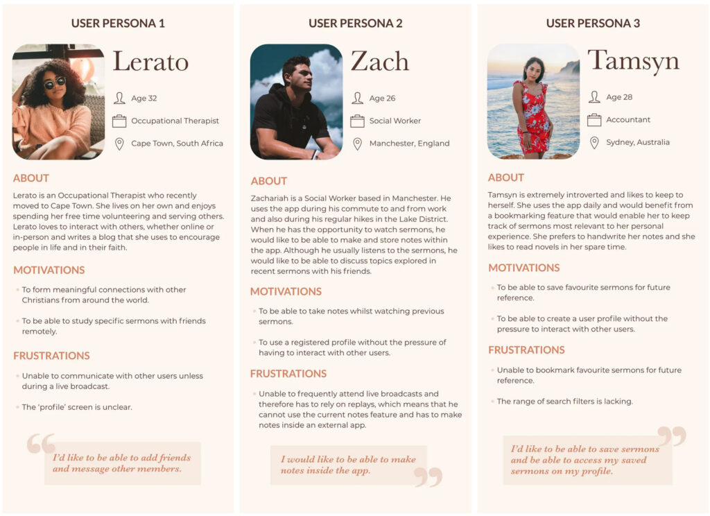
In response to the user interview findings, we created three user personas for typical Yookos App users.
Next, I conducted an analysis of two other church apps to see how their features compare to the Yookos App.
ELEVATION CHURCH STL
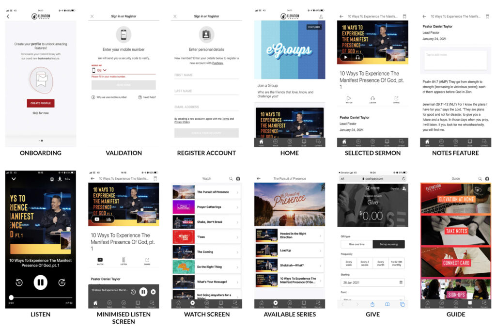
WHY IS THEIR APP SUCCESSFUL?
WHAT ARE THE SHORTCOMINGS?
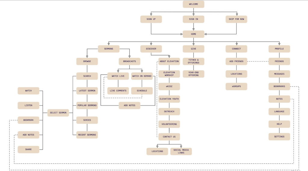
After gathering the insights from our research we went on the create user journeys, flows and the architecture of the app using miro. I have uploaded only one page to save up space.
We then went through a lot of variations of prototypes using hand sketches, low, mid and high fidelity prototypes whilst making iterations as we conduct usability tests.
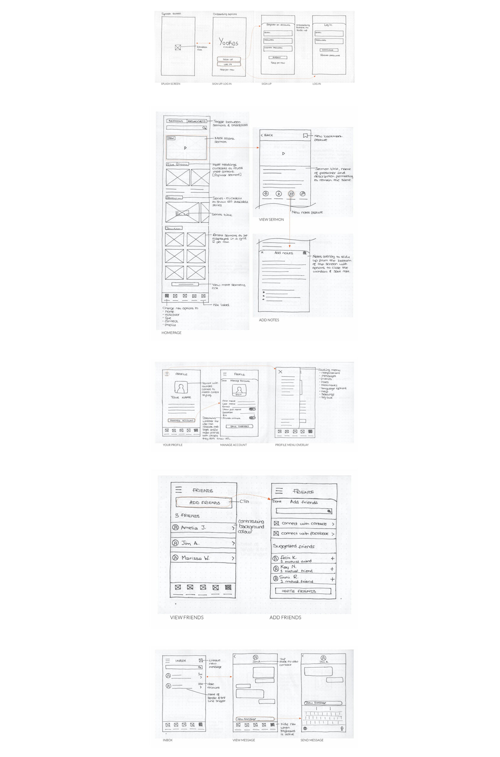
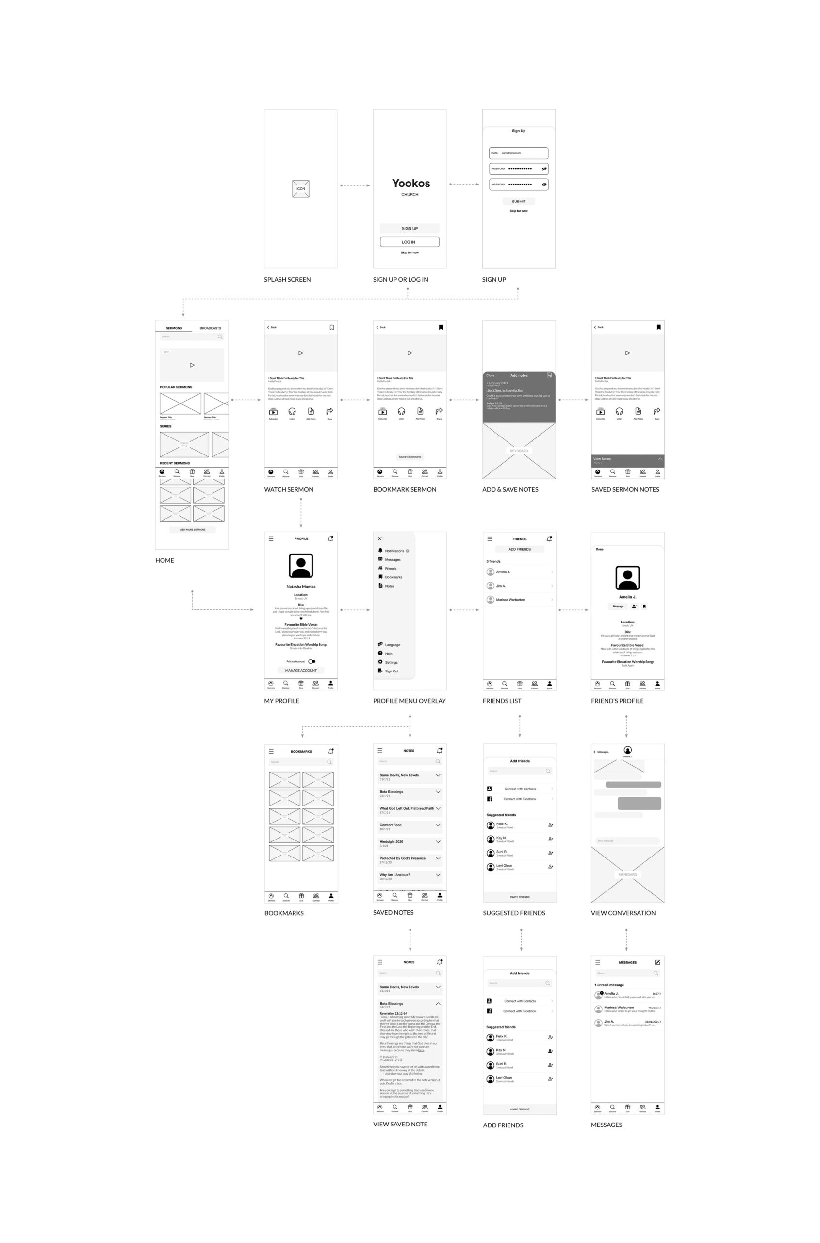
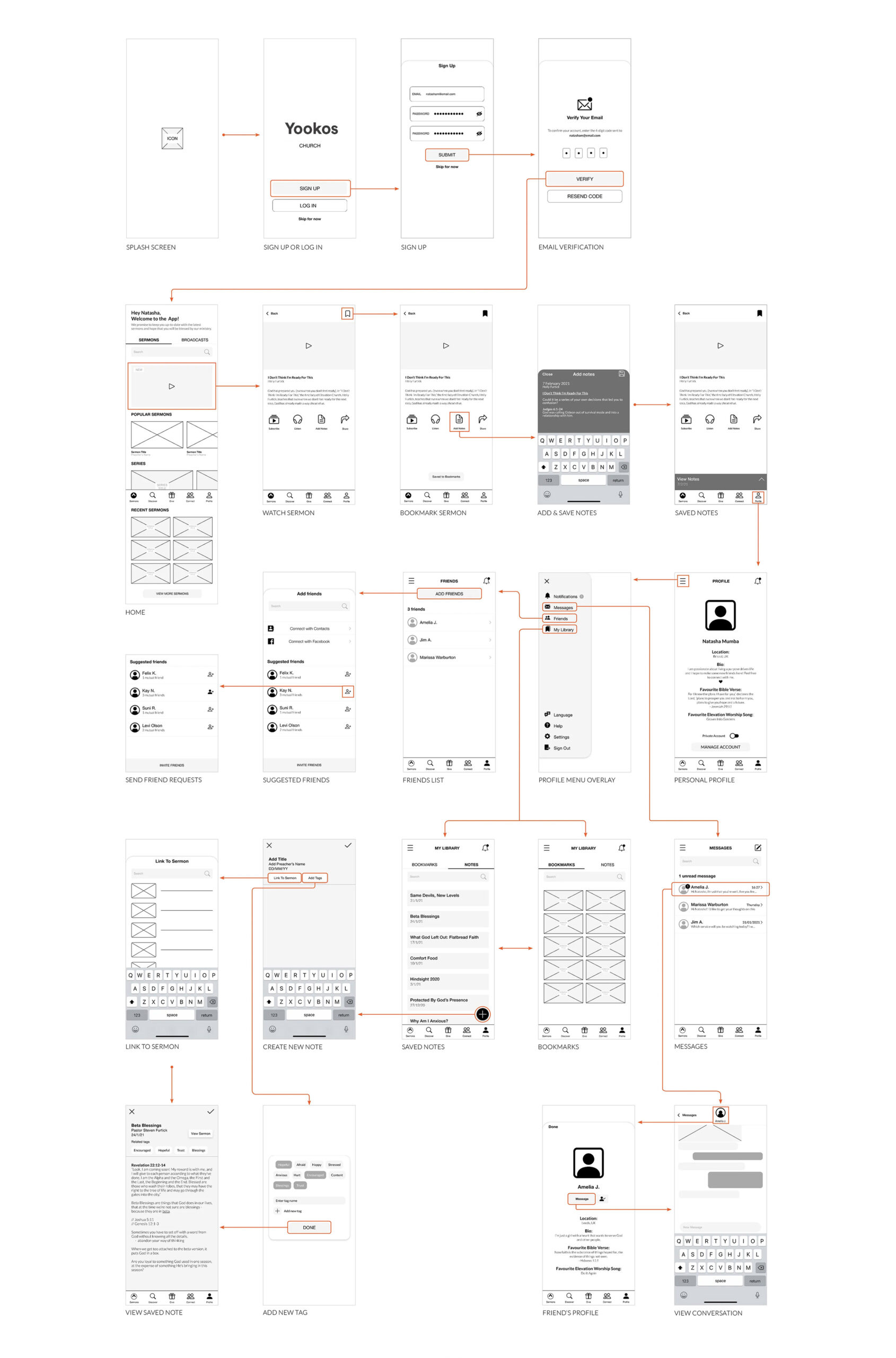
Before moving on to high-fidelity wireframes, I wanted to make sure that my design was functional and met users’ needs. I tested the same five people that I interviewed during the discovery phase.
Analysis of the test results showed that:
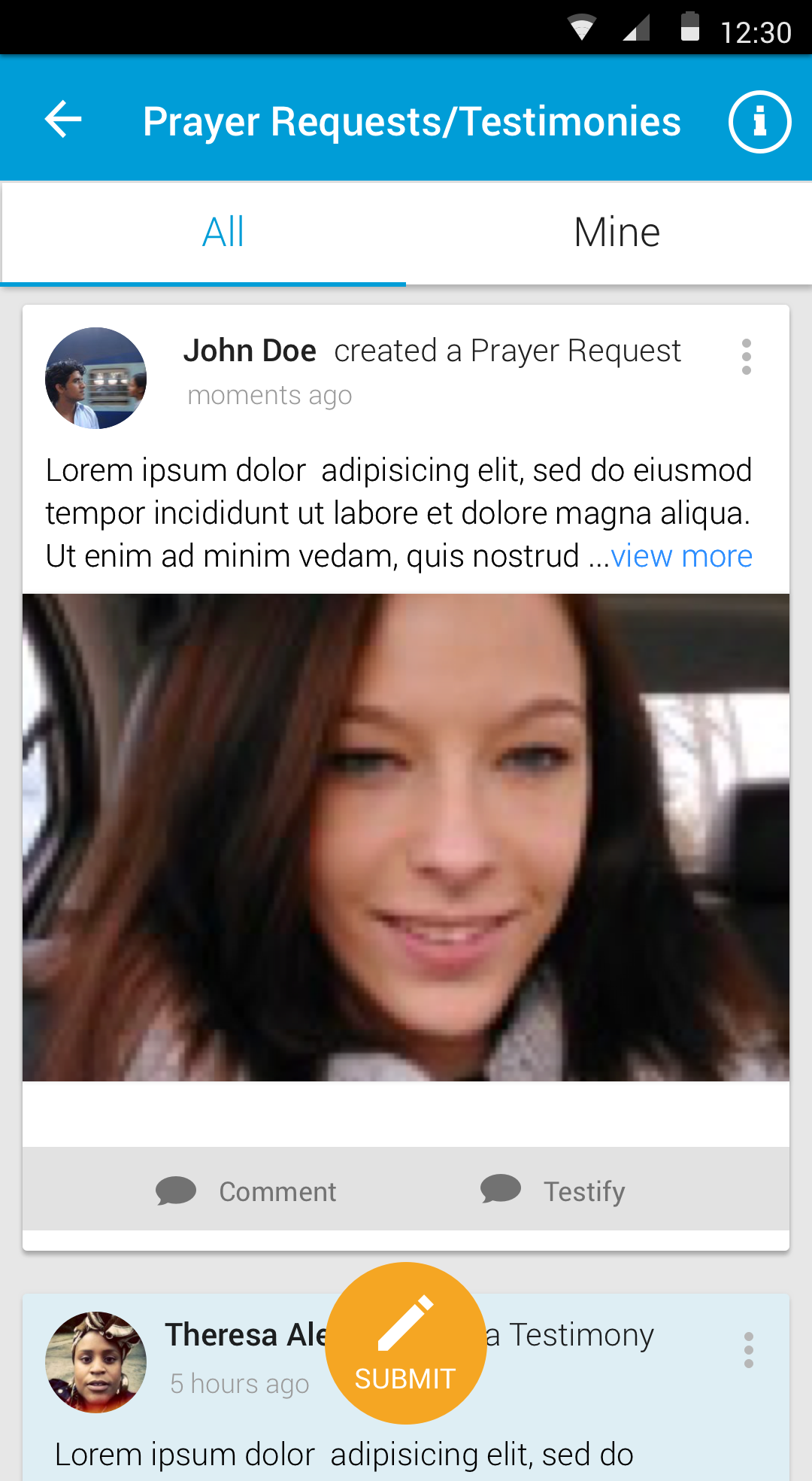
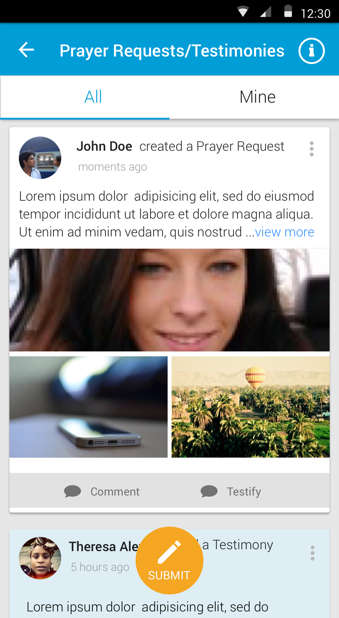
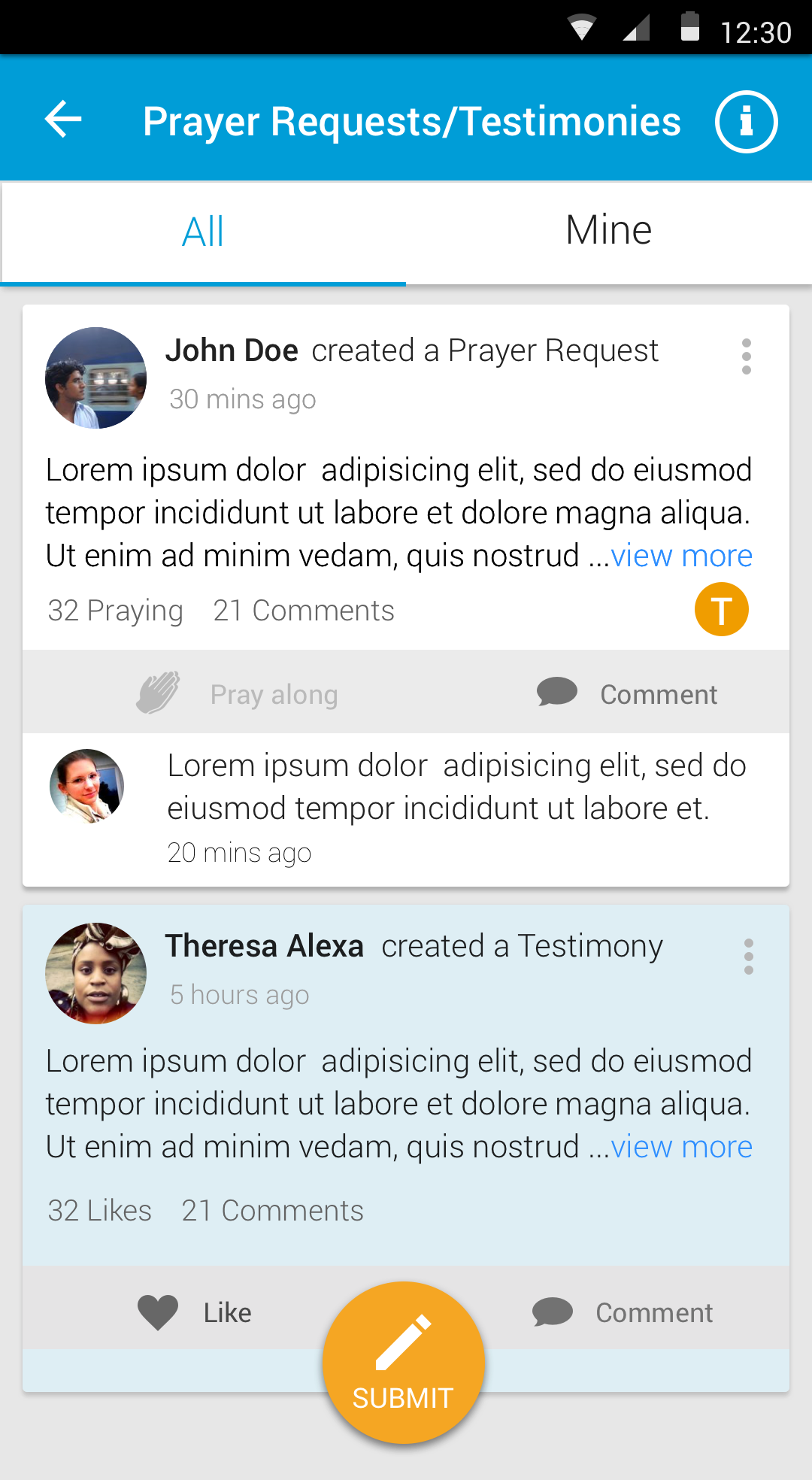
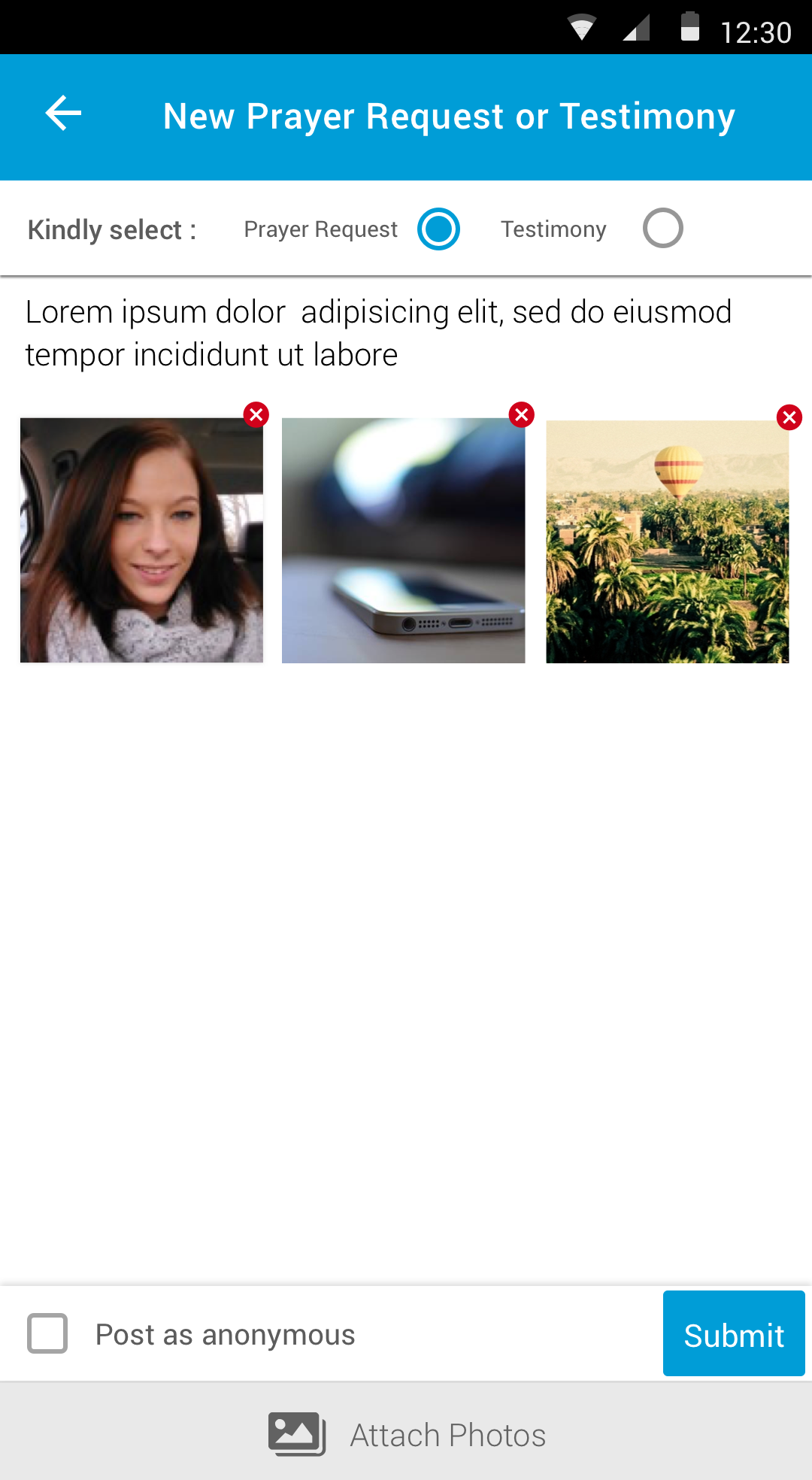
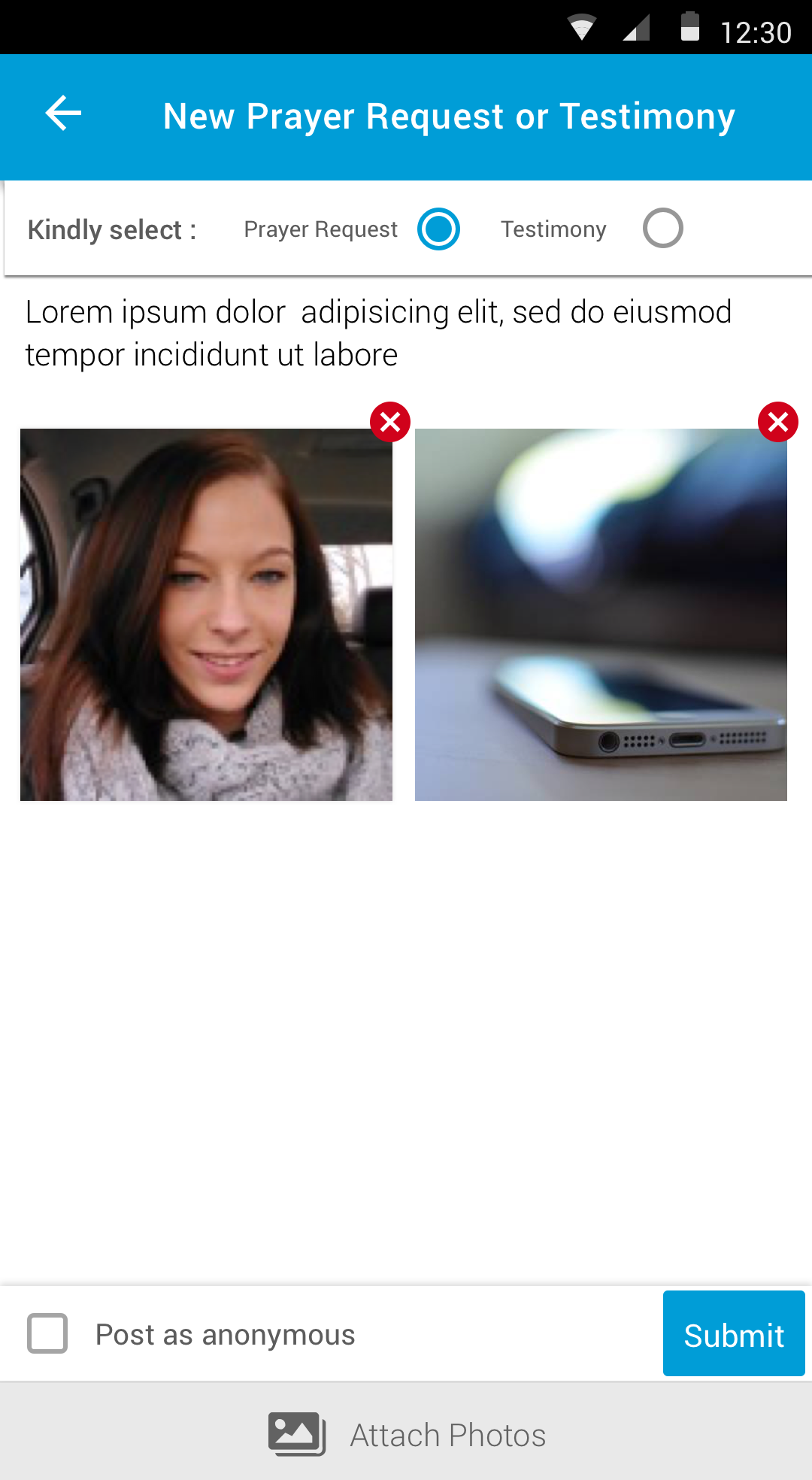
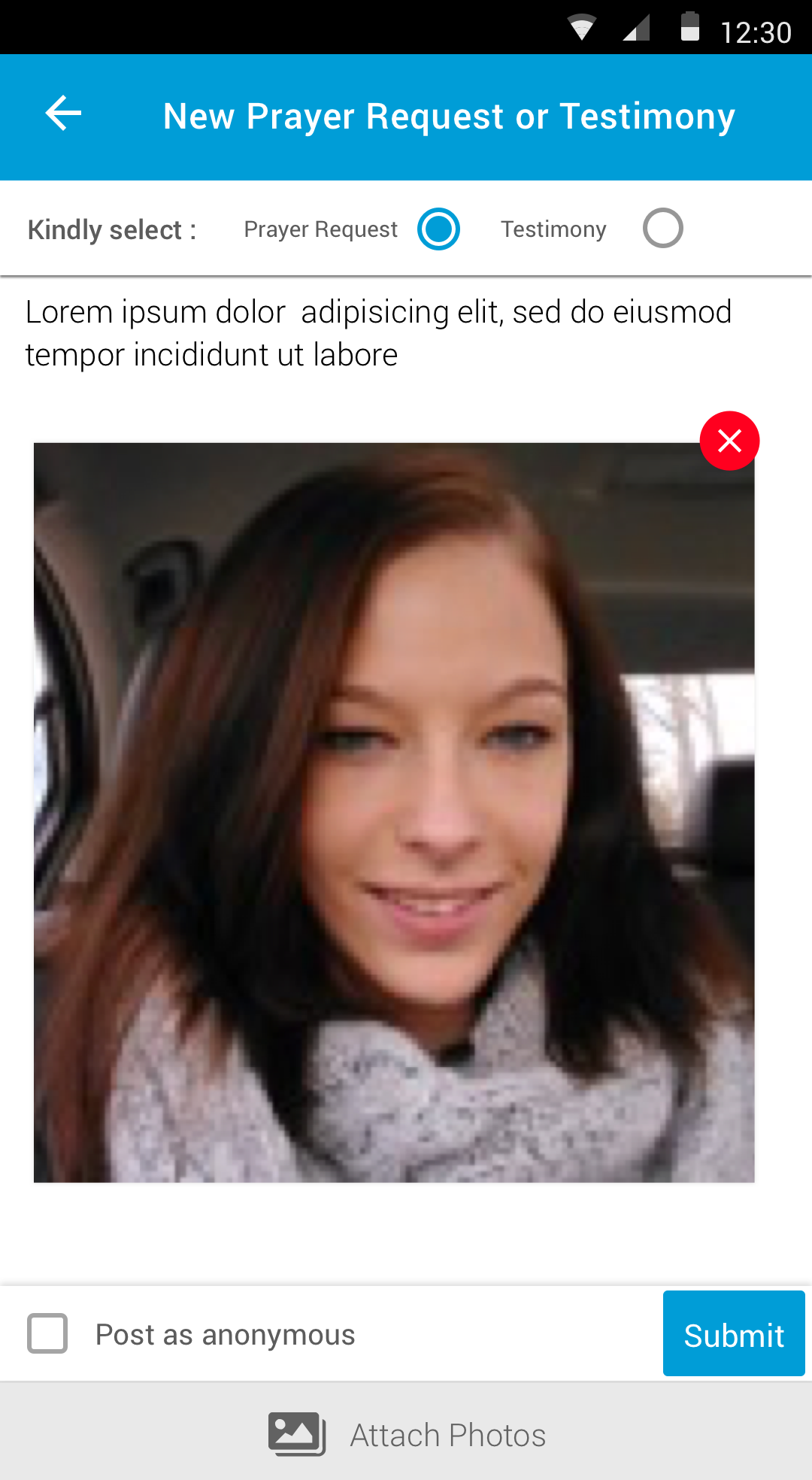
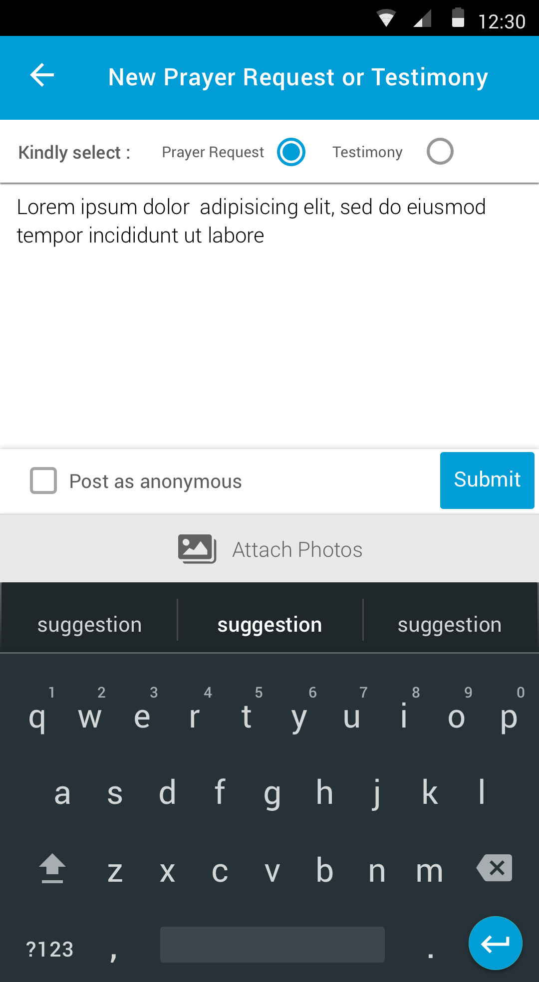
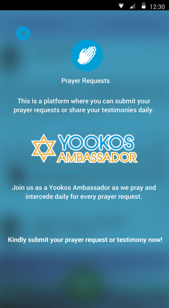
Shortly after conducting the usability tests, we applied minor changes to our final designs. Below are some of the key screens of a feature called “Prayer requests” that we designed.

